What was the Inspiration for this project?
The inspiration to analyse the health and income of the UK comes from reading the book Factulness by Hans Rosling. Probably as a data scientist you have already read this book. If not, I really recommend it as it is one of my favourites ever. He is considered as one of the best data story tellers and pioneer developer of data visualisation tools. In this book, he describes the economical and social prosperity that countries all around the world have experienced during the last decades.

What is the relationship between health and income?
One of the main concepts that he developed is the relationship between Health and Income. Across the different countries there is a relationship that higher income ones will tend to be healthier by using as a reference life expectancy. Moreover, this relationship is not static as countries will increase their life expectancy as they increase their income through economic progress. Below you can find his famous graphic, widely known as the Gapminder graph.

Are there still developed countries and countries in development?
Hans emphasised that there is no more the division between developed countries and countries in development. Such concept was from true but in the 60s! He instead emphasized that the world can be split in 4 income levels. Each of these levels are based on the conditions that the people will live like the food they eat, how they get drinkable water, the way they commute or the bed that they sleep.

Does the relationship of Health and Income exists at a more regional level?
Another point that the author elaborated is that there is no absolute living standard within the same country. Instead the distribution of incomes will still prevail. This means that
- There will be people living in level 1, 2 and 3 regardless if the country is classified as level 4.
- This also applies on the opposite way, a person living in a country with income classified as level 1 could be living with standards of level 4.
This is one of the main points of the book that I found interesting to investigate further, what could be the difference in income across the country that I live, the UK?
How different are the incomes across regions in the UK?
To investigate the different range of incomes of the UK, one of the main reliable sources of data is the Office for National Statistics (ONS). The ONS is the UK’s largest independent producer of official statistics. After some searches I found that they produce Income estimates for small areas in England and Wales. These estimations are produced at a quite local area that enables to distinguish small clusters of high and low income areas. The figure below comes from an interactive map that allows to identify lowest and highest income areas.

At first look, there are high income groups concentrated around London and low income groups in the North of England and Wales. These findings confirm that within the same country it can exist a wide variety of income levels and can help to identify which ones are below and above the country’s median
How different are the life expectancies across regions in the UK?
Also by using data from the ONS, there are available estimates of regional life expectancies for male and females. ONS provide great detail about life expectancies and how they have improved across regions and time. Similar as with Income, ONS also provides an interactive map to drill into more detail on the improvements on life expectancies at regional level. Below you can find the life expectancy at birth for males and females respectively
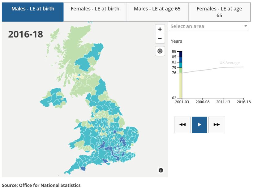
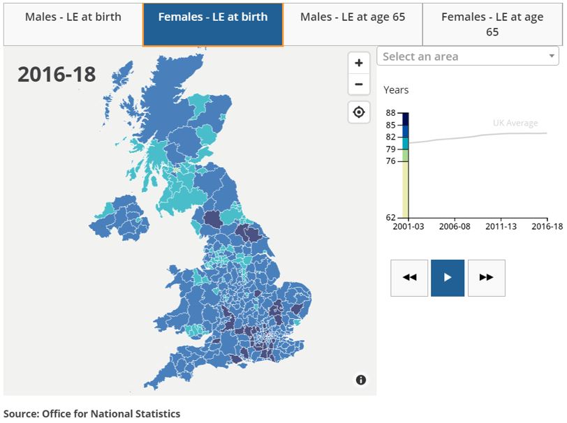
Similar to the Income map, the highest levels of life expectancy are concentrated in the south around London while there are lower life expectancies on the North of England.
From these previous set of maps of income and life expectancies, it appears that there is a similar relationship that Hans found across different countries but this time at different regions within the same country
What is the relationship between health and income in the UK?
Using the data behind the maps, I combined these data sources at area level. Once combined on a single data source I aimed to replicate the same Gapminder graph, this time using the local areas from the UK rather than countries. Below you can find the end result

Interestingly, the relationship between health and income that was found at country level is also found at regional level. To illustrate the diffence across regions, the graph uses colour coding with southern regions using a darker cue. This colour coding shows that there is an indication that southern the regions tend to have higher levels of income and health.
Taking a closer look to the graph:
- The highest levels of income and health on the top right area of the graph shows that many of these areas are London boroughs.
- On the other hand, the lowest levels of income and health that are on the bottom left of the graph are found in areas of the North of England.
How different are Health and Income between London and the North of England?
One way to investigate these differences is to filter only London boroughs and the North East and North West regions. The map below shows these differences using a different colour palette to identify London and the North of England
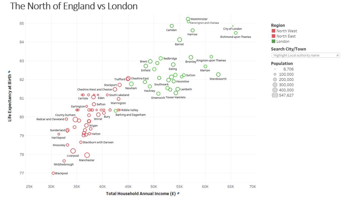
From the map above it shows that there is almost no overlap between these two regions. Only Barking, Dagenham and Newham in London have a similar profile in Health and Income as the North of England.
If we compare the extreme data points of Health and Income:
- Blackpool has the lowest income and an average life expectancy of 77 years with a similar life expectancy than the average of Mexico (my home country!).
- Westminster has the highest life expectancy with more than 85 years, this life expectancy is even higher than the average of Japan.
You can use the interactive visualisation to try to find any other region of interest following the link below:
https://bit.ly/HealthAndIncomeUK
In summary
Using the concepts developed by Hans Rosling on Health and Income and data from the ONS, I managed to replicate the famous Gapminder graph with regional areas of the UK. These findings showed:
- The relationship between Health and Income prevails at regions of the same country.
- Data visualisation helped to identified a clear division between London and the North of England with just minor overlaps between them
I encourage to replicate this data visualisation with information from your country to validate if the relationship between Health and Income also exists!
The above material was originally presented at Toastmasters Data Science Speakers club via Zoom on the 18th May 2020. For more details to join our next meeting follow https://www.meetup.com/datasciencespeakers/
Sources
- Gapminder Website: https://www.gapminder.org
- Dollar Street: https://www.gapminder.org/dollar-street/matrix
- ONS Income in the UK: https://www.ons.gov.uk/peoplepopulationandcommunity/personalandhouseholdfinances/incomeandwealth/bulletins/smallareamodelbasedincomeestimates/financialyearending2018
- ONS Life Expectancy in the UK: https://www.ons.gov.uk/peoplepopulationandcommunity/healthandsocialcare/healthandlifeexpectancies/bulletins/healthstatelifeexpectanciesuk/2016to2018
