On the 30th March 2020 at Data Science Speakers I presented “Where are the most vulnerable people in the UK?”. This talk combines the use of public source data and interactive data visualisations to have a wider understanding of people in need of support from COVID-19 isolation periods. Below you can find the full article:
As with the UK and the rest of the world, we have been observing the impacts of COVID-19 as the pandemic continues to unfold, with a continuous rise in cases and deaths.
This was one of the headlines in the news following the government’s request for volunteers once the UK lockdown was imposed by Boris Johnson:

In the UK it is estimated that there are more than 1.5 million people living with underlying health conditions. These people have been asked to shield themselves from the virus by staying at home for 12 weeks. This means that they will require help to carry out everyday activities that they were used to doing, like purchasing groceries and visiting the GP for medical appointments.
In a response to this, the government put out a request for volunteers to support the NHS through the time that the isolation lasts. A massive 500,000 people signed up in a matter of days! It was deemed a huge success as the government was only expecting half of this. A few days later, this number increased to 750,000 volunteers and the government were forced to pause any new applications so that they could process the applications already received.
What is the objective of this analysis?
However, considering that vulnerable people are spread across the UK, how would the NHS make sure that they had enough volunteers to provide help to people that need it the most? This analysis aims to determine where there are highly concentrated regions of vulnerable people in the UK and where the NHS volunteers should be focusing their efforts.
What are the data sources and assumptions?
The data sources used in this analysis are:
- ONS Population estimates mid-2018. This dataset provides the estimates of population by gender, region and age.
- ONS Healthy life expectancy and disability-free life expectancy 2016-2018. This dataset provides life expectancies, healthy life expectancy and disability-free life expectancy, at birth and at age 65, split by gender and region.
Both data sources were downloaded from the ONS website in Excel format. The data transformation and consolidation was done in R by using the Tidyverse library. See the Sources section for more details of the sources and the code
The following definitions were applied, based on assumptions already applied in the data sources:
- An elderly person is assumed to be any person over 65 years old and living in the UK
- A status of ‘good health’ is defined as:
- “Very good or good” health conditions
- “No” limitations to perform day-to-day activities
These two sources were combined by region and area level to have a meaningful granularity of analysis.
Where is the oldest population in the UK?
The dataset of Population Estimates has the estimates of the number of people for each age, gender and area of the UK. In this case, by using a proportion of people above a specific elderly age we can identify the areas in the UK with the higher percentage of people in the UK. In this case and to align with the dataset of Life expectancies this threshold is set to 65 years old.
The graphic below shows the areas with the highest proportion of population over 65 years old.

From this graphic, three of the five oldest areas are located in the South of England while the other two are in Wales.
The areas with the highest proportion have more than 25% of people above 65 years old.
The five areas with the lowest proportions have just above 5% all of them located in London.
Where are the least healthy populations in the UK?
The dataset of Healthy life expectancies has available life expectancies data, life expectancies of a good healthy condition and life expectancy of disability-free to perform every activities. This data is available by gender, region and life expectancies calculated at birth and of a person that has reached 65 years old. This data set can be used to identify the groups with the lower life expectancy with a good healthy condition.
To find the least healthy population in the UK, the first step to do is to calculate the average between the the Healthy life expectancy and disability-free life expectancy across males and females as an approximation of overall healthy years lived. This number will represent the number of years that a person alive at 65 will live with a good health condition.
The graphic below will show the lowest and highest life healthy expectancies by area:

The lowest average where the areas with the lowest life healthy expectancies will not reach 73 years old on a good health condition. From the five lowest areas two of them are located in Wales. Comparing these figures with the areas with the highest expectancies in the graphic beneath, people will live on average five healthy years more
Where are the majority of the least healthy regions in the UK?
By combining the two metrics of percentage of population and expectancy of healthy years, it was possible to identify the regions where potentially many of the UK’s vulnerable people are concentrated.
- Each point represents an area of the UK; the size of the point is representative of overall population.
- The shade of blue of each point represents how north and south each region is geographically located.

The most vulnerable areas of the UK (highest proportion of people over 65 years old and the lowest healthy life) are in the upper left region as indicated in the graphic below:

How does the North of England compare with the South?
It can be seen that the darker shade of the colours tends to cluster to the bottom right, showing that Southern England tends to have younger populations with healthier life status.
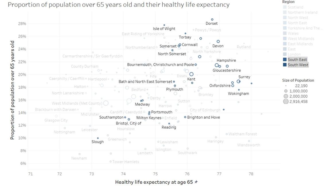
In contrast, the North West and North East regions are mainly concentrated in the upper left side of the chart showing that they are more vulnerable than the South.

How does London compare with the rest of the country?
Most parts of London are located in the bottom right, with several of them reaching the highest healthy life expectancies.

How does an specific area compares with the rest of the country?
The graphics shown in this analysis are generated by using Tableau that allows the user to interactive with the data visualisation. This analysis has been uploaded to Tableau Public to make it accessible to everyone to use it by using any platform through web browser without the use of any specific software.
The data visualisation can be accessed only in the following link http://bit.ly/UKVulnerablePeople .
What can we summarise from this analysis?
Our analysis shows that by using data from ONS in the data visualisation tools, allows us to identify the key regions with vulnerable people i.e. a higher proportion of elderly people with low healthy life expectancies. It shows is that there is a trend where the South of England shows higher healthy life expectancies than the North of England, while London has the lowest proportions of elderly people.
This analysis in conjunction with the interactive visualisation tool can be used to identify areas that will likely require a higher number of NHS volunteers. As of 6th April, the applications for NHS Volunteers it is still paused with the initial 750,000 applications received with no further announcements on the allocation of them.
What I learned from doing this analysis?
One of the reasons of doing this analysis was to apply some of my “stay at home” time to something different than Netflix! But out of joke, I think that using my data science skills might be valuable if by using that after using this tool will feel more encourage to support their community. Finally, it also help me to understand more the sociodemographic of the United Kingdom with the use of ONS data
Sources for this analysis
-BBC Article:
https://www.bbc.co.uk/news/uk-52029877
-Population Estimates for UK, England and Wales, Scotland and Northern Ireland: Mid-2018, using https://www.ons.gov.uk/peoplepopulationandcommunity/populationandmigration/populationestimates/datasets/populationestimatesforukenglandandwalesscotlandandnorthernireland
-ONS Healthy life expectancy and disability-free life expectancy 2016-2018
https://www.ons.gov.uk/peoplepopulationandcommunity/healthandsocialcare/healthandlifeexpectancies/datasets/healthstatelifeexpectancyatbirthandatage65bylocalareasuk
-The R code and Tableau dashboard is also available in the following GitHub Repository
https://github.com/eduardo-cc/UKVulnerablePeople
Special thanks to Jenika Karsan from 4most that helped me with the proof reading and editing of this article!
